The hotspot_*() functions return simple-feature (SF) objects with specialised classes. autoplot() recognises those classes and chooses a variable, colour scale, and legend suited to the result. Some choices also depend on the columns or attributes present in the result.
The maps below show examples of the default maps produced for each hotspot_*() function, based on the memphis_robberies, memphis_precincts and memphis_population datasets included in the package. To get started, we create a grid covering the city of Memphis and transform the dataset to use an appropriate projected coordinate reference system (CRS), since that makes specifying cell size, etc., easier.
Linking to GEOS 3.13.0, GDAL 3.8.5, PROJ 9.5.1; sf_use_s2() is TRUE
Data transformed to "WGS 84 / UTM zone 16N" co-ordinate system.
ℹ CRS code: "EPSG:32616".
ℹ Unit of measurement: metre.
memphis_precincts_proj <- st_transform_auto(memphis_precincts, quiet = TRUE)
memphis_population_proj <- st_transform_auto(memphis_population, quiet = TRUE)

# Set up consistent grids of cells
memphis_grid <- hotspot_grid(memphis_precincts_proj, cell_size = 500)
Grid size
The 500-metre grid cells used in these examples may be too coarse for many analytical purposes, but are used here because of constraints on rendering time for R package vignettes. In practice, the cell size should be chosen to suit the spatial scale of the data and the research question.
In each case the autoplot() method loads a map with no base map by default. For each of the above functions a corresponding hotspot_map() method exists that by-default also includes a base map with suitable attribution, etc. hotspot_map() can also be used for mapping ordinary sf objects.
hotspot_count()
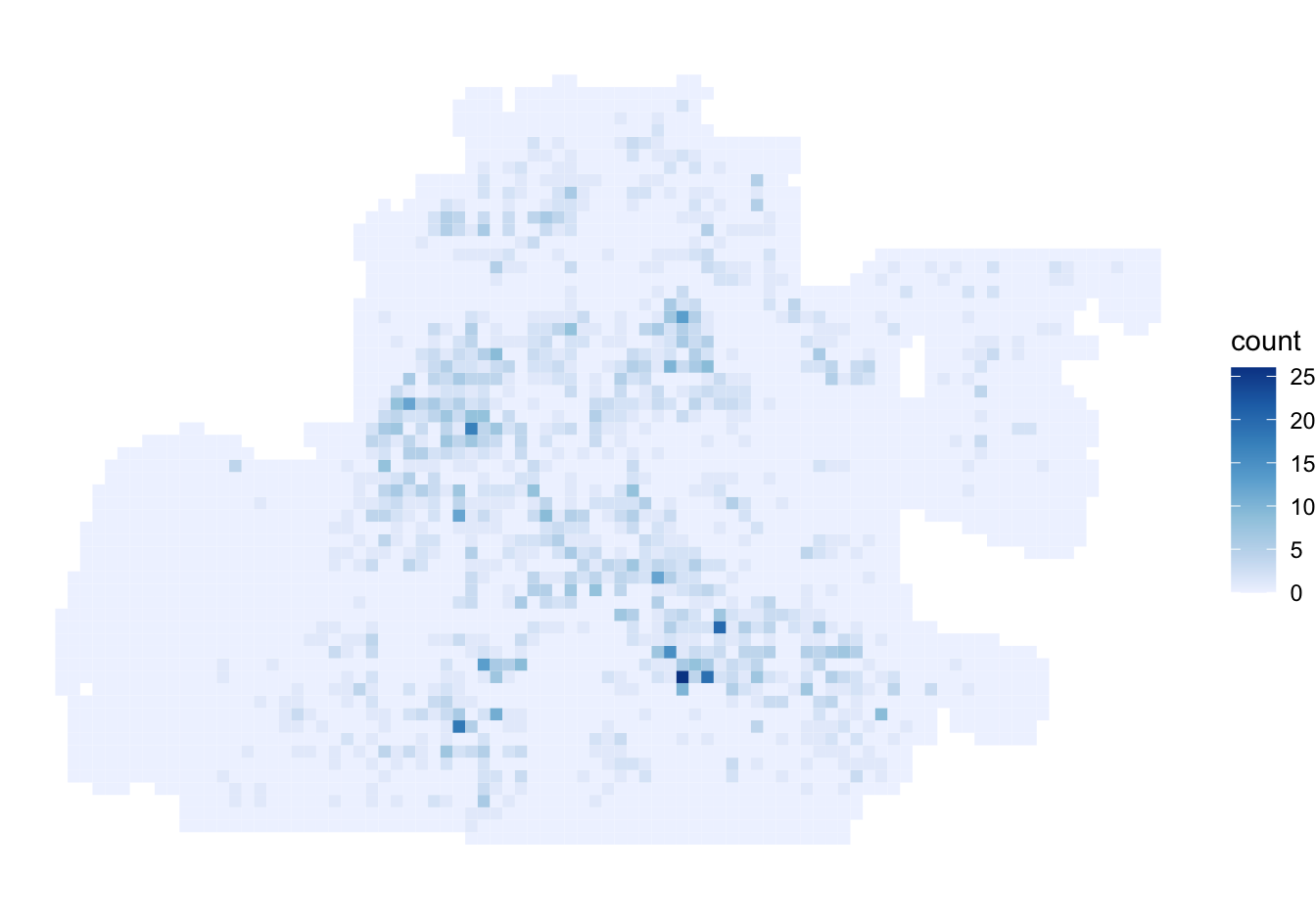
For an unweighted point count, autoplot() maps the n column.
memphis_robberies_count <- hotspot_count(
  memphis_robberies_proj,
  grid = memphis_grid
)

autoplot(memphis_robberies_count)
If hotspot_count() is given weights, its result also contains a sum column. The plotting methods detect that column and map the weighted count instead.
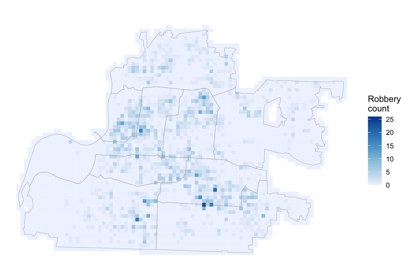
hotspot_layer() applies the same variable mapping as autoplot(), but returns a layer so that it can be combined with other ggplot2 layers. It is a student-friendly wrapper around ggplot2::autolayer(). For example, a count layer can be drawn with precinct boundaries.
hotspot_layer() is particularly useful because it allows control of where the layer derived from the result produced by a hotspot_*() function appears in a stack of other spatial layers, so that (for example) it can be placed on top of a base map.
hotspot_kde()
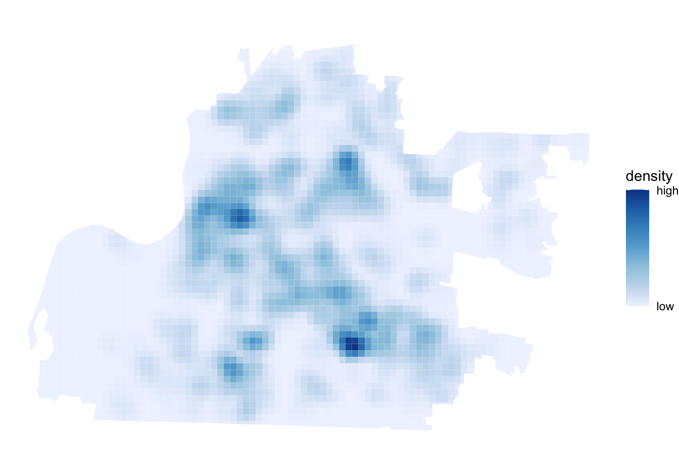
When provided with an object produced by hotspot_kde(), autoplot() maps the kde column. The default colour scale is sequential, with darker blue indicating greater density. Note that since hotspot_kde() produces density estimates for the convex hull of the data, the resulting map may extend beyond the precinct boundaries. hotspot_clip() can be used to restrict the KDE to the specific area covered by the point dataset to avoid displaying spurious density estimates for areas not covered by the data.
Bandwidth set automatically based on rule of thumb.
ℹ Adjusted bandwidth = 1,397 metres (0.25 * 5,588 metres).
Removed 179 rows (5.0% of original rows) from `data`
hotspot_dual_kde()
hotspot_dual_kde() can compare the density of two spatial datasets in four ways. The method is recorded in the method attribute of the result, which autoplot() and hotspot_layer() use to select the appropriate colour scale. The following examples use the same robbery and population data, bandwidth and grid so that the effect of changing only method is visible.
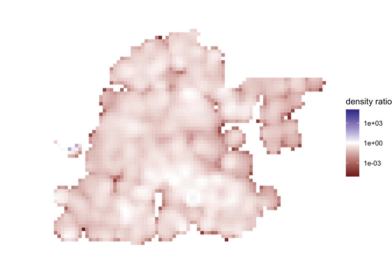
The default, method = "ratio", divides the density of the first dataset by the density of the second. This is analogous to mapping a rate. The map uses a sequential scale applied directly to the ratio values, without treating one as a change point or transforming the scale.
hotspot_dual_kde(
  memphis_robberies_proj,
  memphis_population_proj,
  method = "ratio",
  bandwidth_adjust = 0.25,
  grid = memphis_grid
) |>
  autoplot()
Bandwidth set automatically based on rule of thumb.
ℹ Adjusted bandwidth for `x` and `y` = 1,397 metres (0.25 * 5,588 metres).
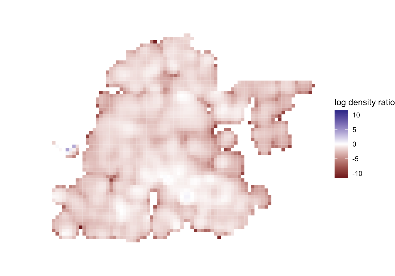
method = "log" calculates the natural logarithm of the density ratio. Zero then represents equal densities, negative values indicate a lower robbery density relative to population density, and positive values indicate a higher relative robbery density. Although zero denotes equality, it is not treated as a colour-scale boundary: a continuous sequential scale represents progression from lower to higher logged ratios.
hotspot_dual_kde(
  memphis_robberies_proj,
  memphis_population_proj,
  method = "log",
  bandwidth_adjust = 0.25,
  grid = memphis_grid
) |>
  autoplot()
Bandwidth set automatically based on rule of thumb.
ℹ Adjusted bandwidth for `x` and `y` = 1,397 metres (0.25 * 5,588 metres).
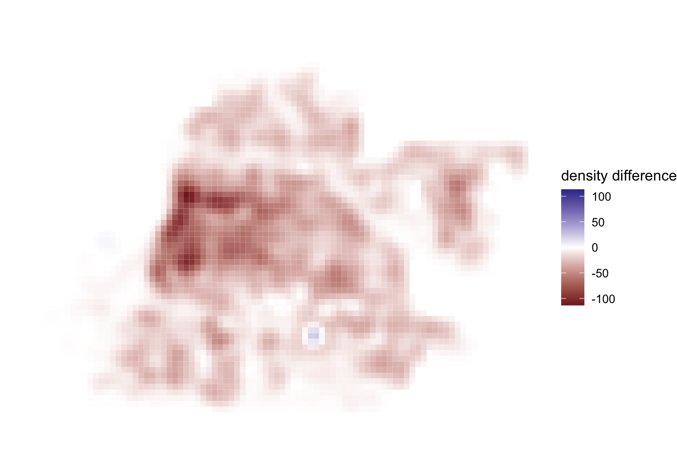
method = "diff" subtracts the density of the second dataset from that of the first. This is the only method for which autoplot() uses a diverging scale: negative and positive differences are shown on opposite sides of zero.
hotspot_dual_kde(
  memphis_robberies_proj,
  memphis_population_proj,
  method = "diff",
  bandwidth_adjust = 0.25,
  grid = memphis_grid
) |>
  autoplot()
Bandwidth set automatically based on rule of thumb.
ℹ Adjusted bandwidth for `x` and `y` = 1,397 metres (0.25 * 5,588 metres).
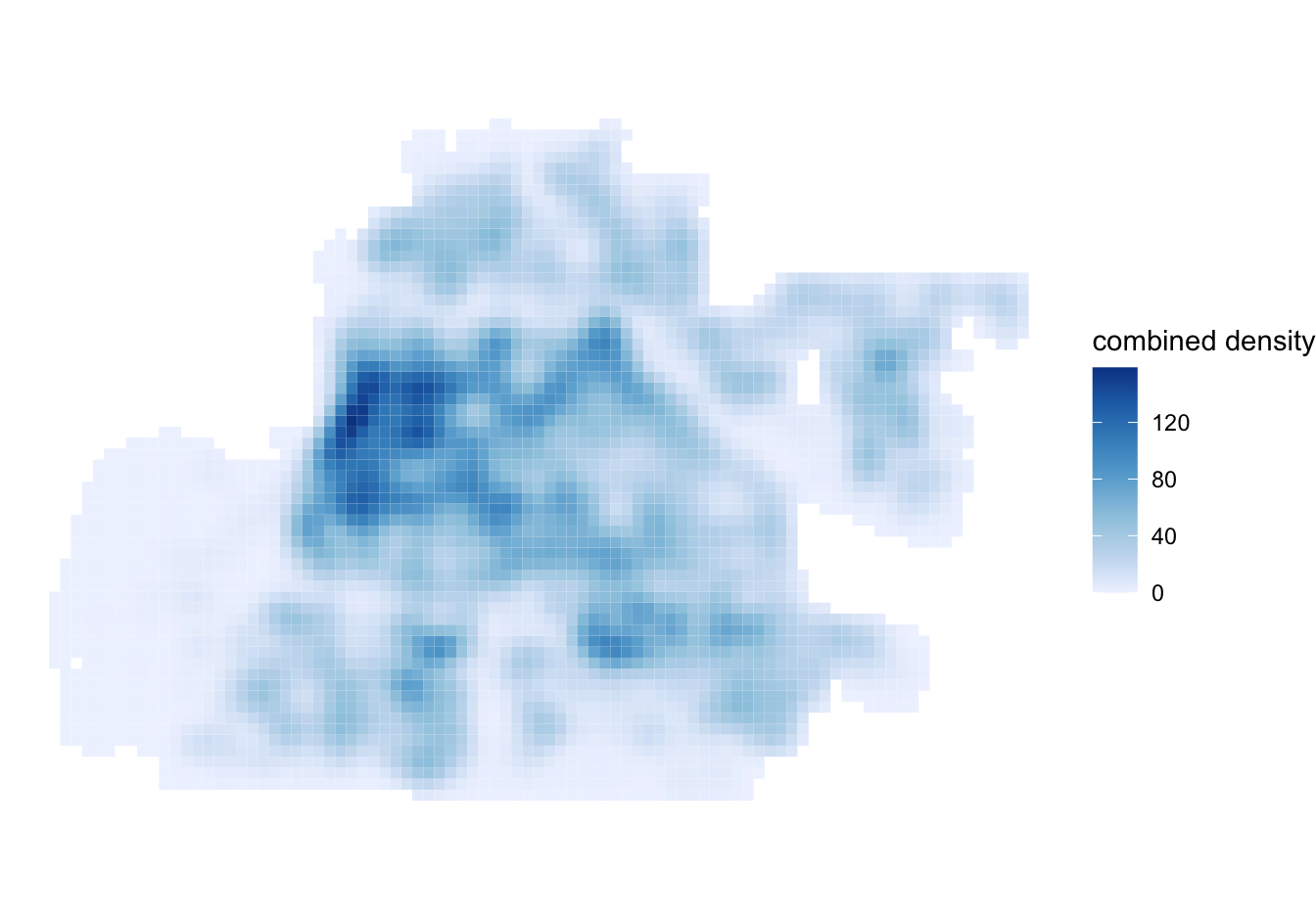
Finally, method = "sum" adds the two density surfaces. Since sums are non-negative, they are shown with a sequential scale: darker cells have a higher combined density.
hotspot_dual_kde(
  memphis_robberies_proj,
  memphis_population_proj,
  method = "sum",
  bandwidth_adjust = 0.25,
  grid = memphis_grid
) |>
  autoplot()
Bandwidth set automatically based on rule of thumb.
ℹ Adjusted bandwidth for `x` and `y` = 1,397 metres (0.25 * 5,588 metres).
Each legend uses low at its lower end and high at its upper end. These labels describe position within the values produced by the selected method; they do not imply that the four methods produce directly comparable numeric values.
hotspot_change()
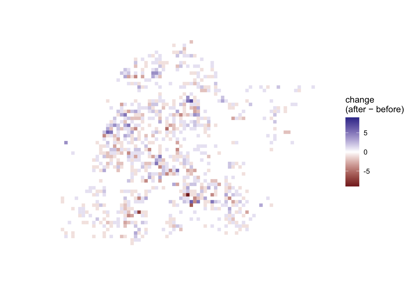
hotspot_change() returns the differences between the number of points in each area in two time periods. Its scale is symmetric around zero so increases and decreases of the same size receive equal visual emphasis.
hotspot_classify()
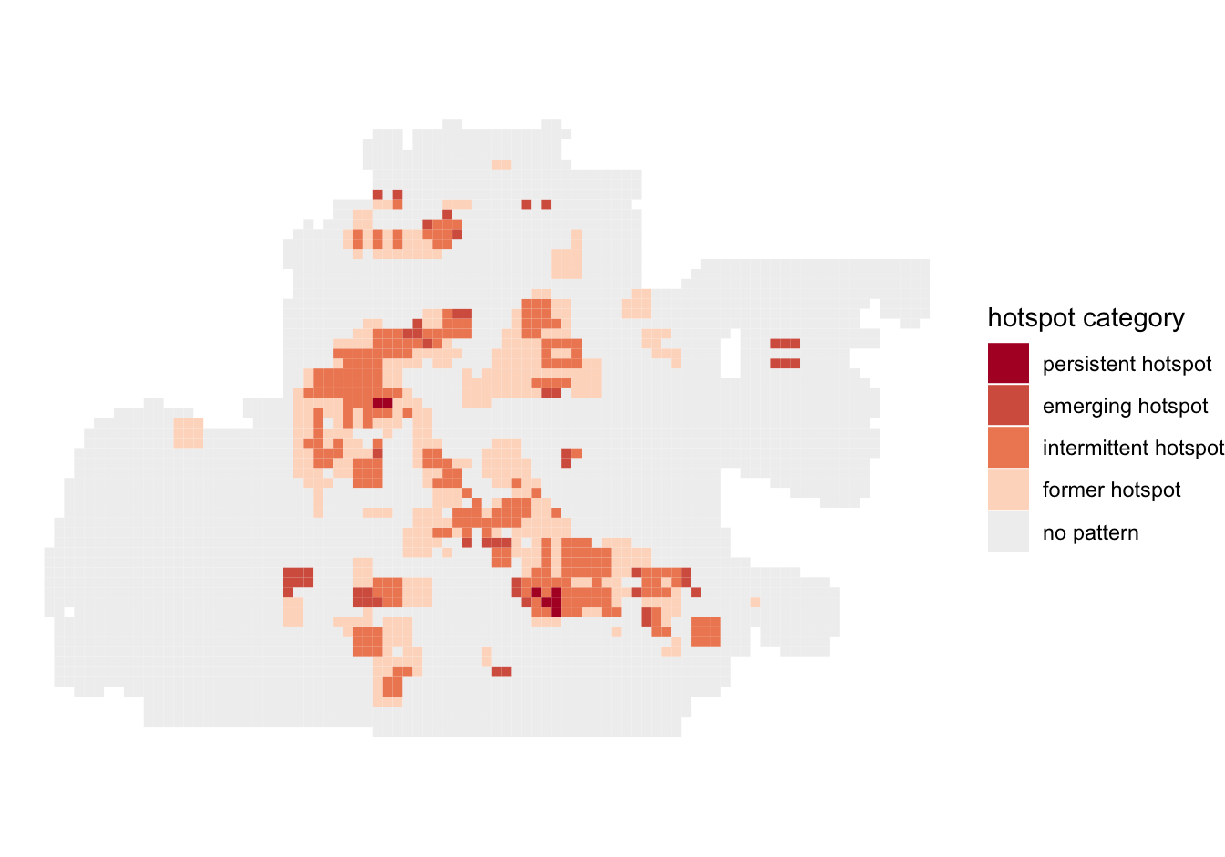
hotspot_classify() categorises grid cells based on their hotspot and coldspot status over time. The default palette uses warm hues for hotspot categories, cool hues for coldspot categories, purple for mixed results, and grey for no pattern.
Date range data is not a multiple of chosen period.
ℹ Final period contains 0.6 month.
ℹ Set `collapse = TRUE` to collapse that period into penultimate period.
hotspot_gistar()
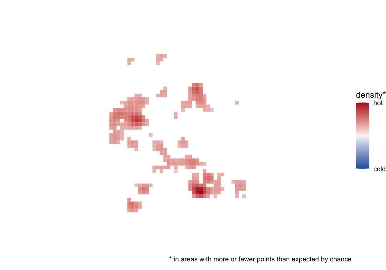
By default, hotspot_gistar() returns density estimates and p-values for each cell alongside the Getis-Ord Gi* statistic. The plotting methods use the p-values to select which cells are visible, then map the density of points in each visible cell. The critical_p and sign arguments to autoplot()/hotspot_layer() can control this behaviour. Cells with pvalue >= critical_p are transparent. The default is critical_p = 0.05. The sign argument can be used to restrict the visible cells to those with significant positive or negative Gi*/Gi values. When both signs are shown, a diverging scale distinguishes cold spots from hot spots; cold-spot densities are negated only for plotting. When only hot spots or only cold spots are shown, a medium-to-dark blue scale ensures that every significant cell remains visible.
Bandwidth set automatically based on rule of thumb.
ℹ Adjusted bandwidth = 1,397 metres (0.25 * 5,588 metres).
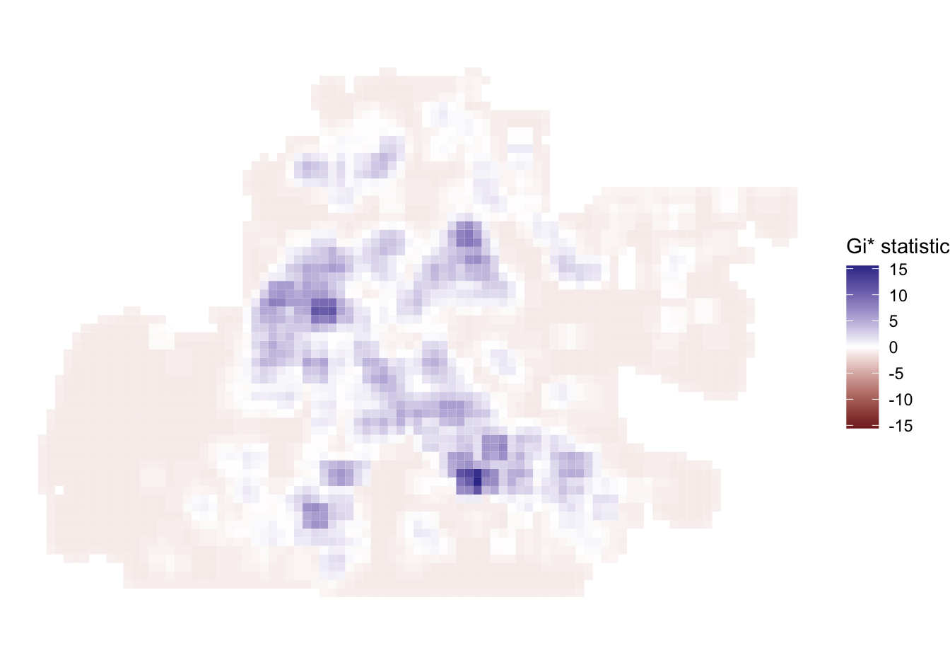
If kde = FALSE, the result has no kde column. The plotting methods instead map the gistar column using a diverging scale centred on zero. In this case, the critical_p and sign arguments to autoplot()/hotspot_layer() are ignored.
memphis_robberies_proj |>
  hotspot_gistar(grid = memphis_grid, bandwidth_adjust = 0.25, kde = FALSE) |>
  autoplot()
hotspot_dbscan()
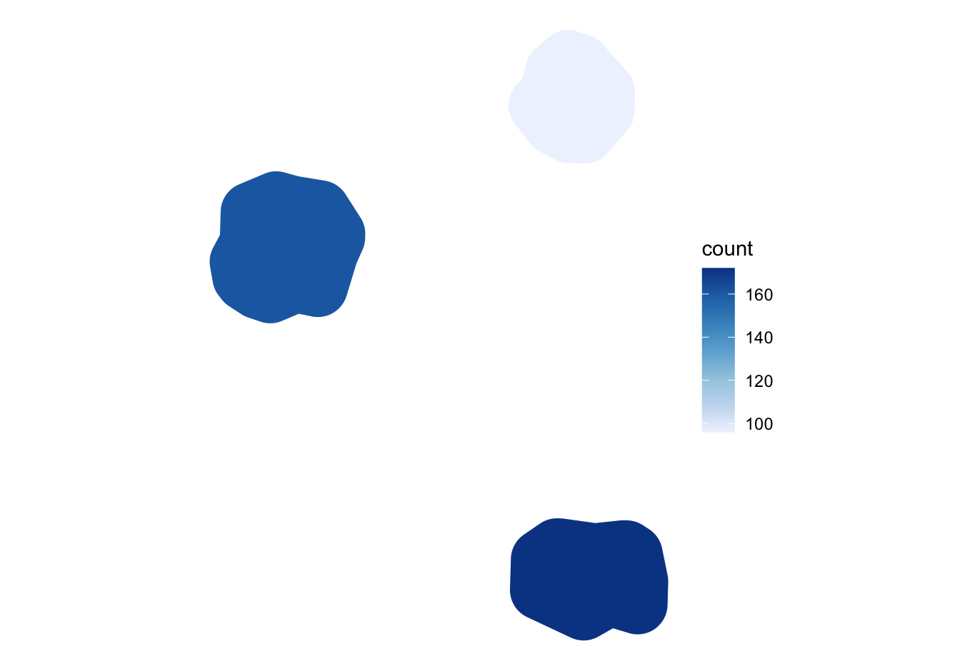
hotspot_dbscan() returns polygons covering clusters of points identified by the DBSCAN algorithm. By default, the fill aesthetic is mapped to the n column, which counts the number of points in each cluster. This can be changed using the col_fill argument to autoplot() or hotspot_layer(). Polygons can also be labelled using the col_label argument to autoplot() or hotspot_layer(). The default colour scale is sequential, with darker blue indicating clusters with more points.
Minimum points set automatically from the number of point coordinates.
ℹ `min_pts` = 48.
Neighbourhood distance set automatically from nearest-neighbour distances.
ℹ `eps` = 863.2 metres; `density_adjust` = 3.
Isobands
The numeric grid outputs from hotspot_count(), hotspot_kde(), hotspot_dual_kde(), hotspot_change() and hotspot_gistar() can be generalised into isobands using hotspot_isoband(). The categorical output from hotspot_classify() cannot be converted because isobands require numeric values on a regular square grid.
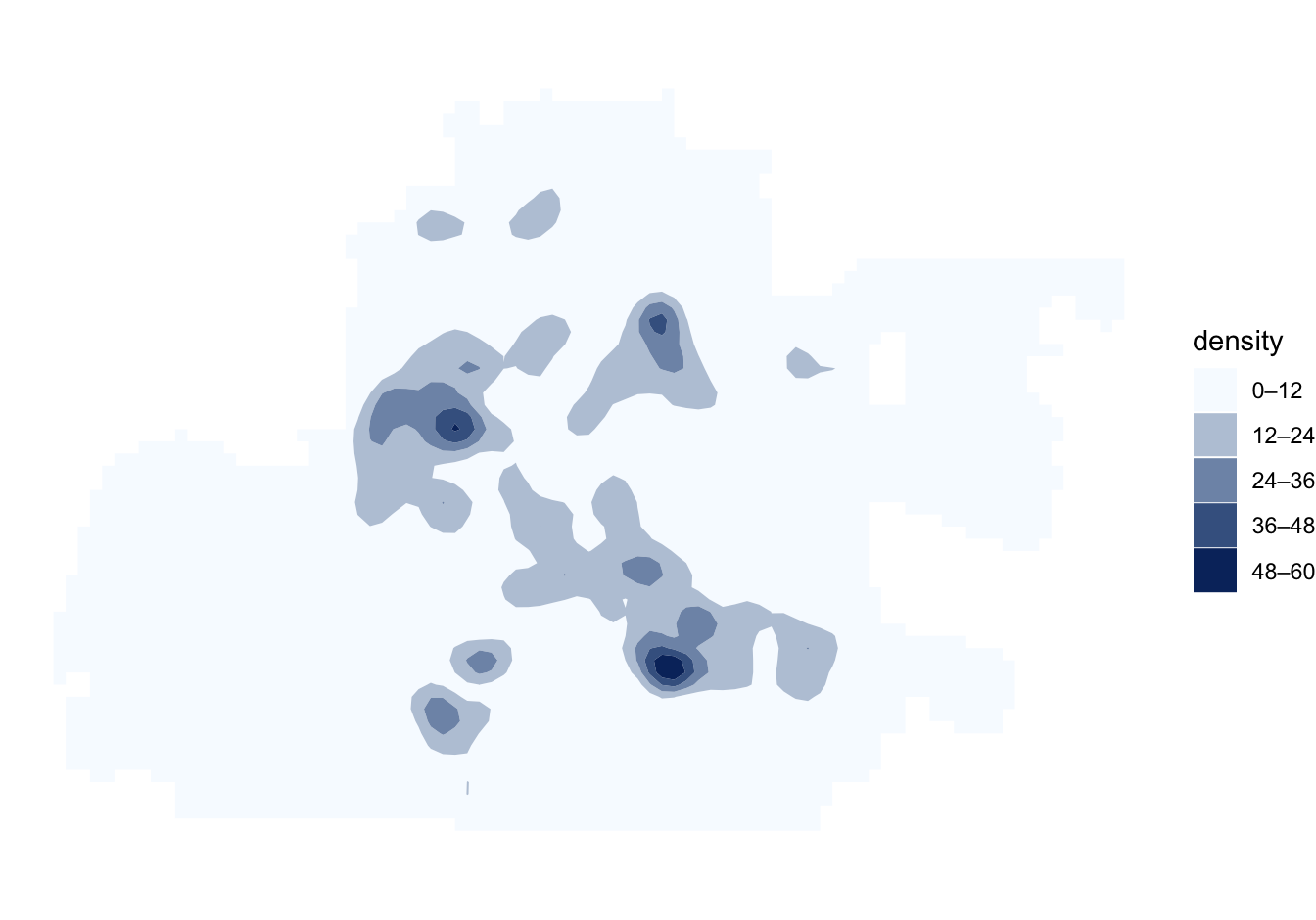
Isobands retain information about the original hotspot_*() result and can themselves be plotted using autoplot() or hotspot_layer(). The default palette, legend and treatment of meaningful values such as zero therefore depend on the function that produced the original grid. For example, KDE isobands use a sequential scale:
Bandwidth set automatically based on rule of thumb.
ℹ Adjusted bandwidth = 1,397 metres (0.25 * 5,588 metres).
Customising plots
autoplot() returns an ordinary ggplot object, so scales, labels, themes, and other layers can be added or replaced with ggplot2. hotspot_layer() is useful when the sfhotspot result is one component of a larger map. See the individual method help pages for the arguments accepted by each method.
An optional map-tile background can provide geographic context. This requires the suggested ggspatial package and an internet connection unless the tiles are already cached. When a base map is requested, the hotspot layer is drawn with an alpha of 0.75 so that the background remains visible.
autoplot(
  memphis_robberies_count,
  basemap_type = "osm",
  basemap_zoom = 12
)
The default remains basemap_type = "none", so ordinary plots never download tiles. Known map types receive an attribution caption automatically. For a custom or new map type, supply the provider’s required statement explicitly using basemap_attribution. Use caption to add contextual information such as the map author, date or notes. This text appears above any explanatory caption and base-map attribution, which are retained automatically.